graphic element settings
Double click a graphic element to display its Properties dialog box and customize its appearance.
A graphic element dialog box contains 10 tabs:
|
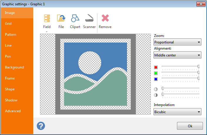 Image: selection of an image to be displayed. You can load a static image from disk, import it from a TWAIN
source (such as a scanner), load it from the Clipart* library or link it to a database field, as detailed in the Link to a data source
section below. See the working with images
section for an explanation on how to manipulate images with Labeljoy. Image: selection of an image to be displayed. You can load a static image from disk, import it from a TWAIN
source (such as a scanner), load it from the Clipart* library or link it to a database field, as detailed in the Link to a data source
section below. See the working with images
section for an explanation on how to manipulate images with Labeljoy.
* Clipart images are not available in the Light version.
|
|
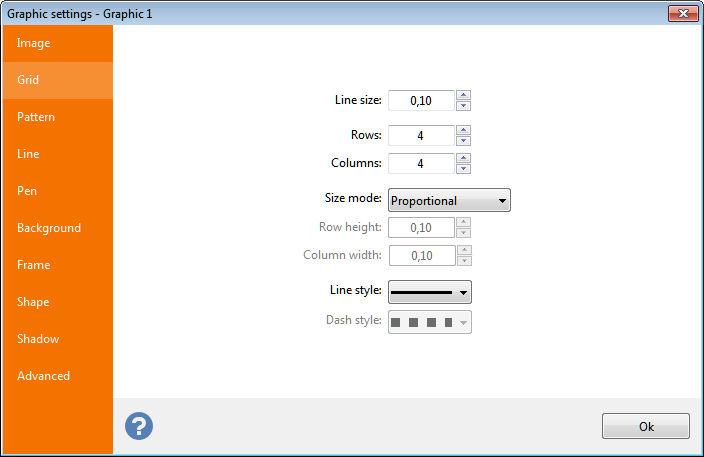 Grid: set the Line size to a value greater than zero to activate drawing of a grid. Grid: set the Line size to a value greater than zero to activate drawing of a grid.
Quickly create a grid element by defining the number of rows and columns.
Select between Proportional and Fixed modes to determine if grid lines will be spread inside the element based on the number of lines or based on a specific size.
Line style and Dash style define the way grid lines are drawn. |
|
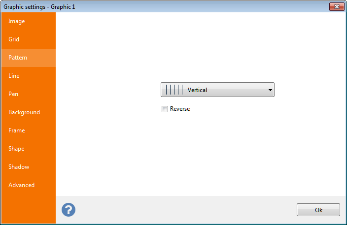 Pattern: you can choose a pattern to be applied to the element background from a list of 52 available different patterns. Pattern: you can choose a pattern to be applied to the element background from a list of 52 available different patterns.
Check the Reverse check box to invert the coloring between the pattern and its background. |
|
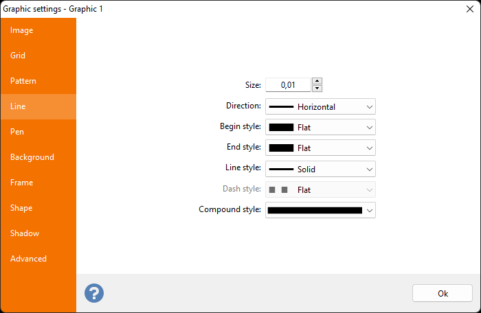 Line: Set a Size to a value greater than zero to draw a line across the element's center. Line: Set a Size to a value greater than zero to draw a line across the element's center.
Select between Horizontal or Vertical direction.
Define the beginning and ending style of the line through the Begin style and End style combo boxes. Define the style of the line through the Line style
combo box. If you select a style other than Solid, �the Dash style
combo box will also become active to enable you to define a dash style for the beginning and ending portion of the dashes.
|
|
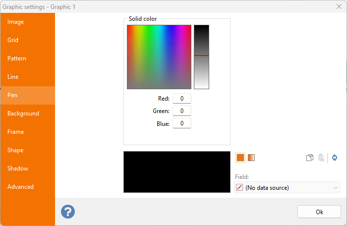 Pen: color definition used by Grids, Patterns and Lines. Pen: color definition used by Grids, Patterns and Lines.
See the Defining colors topic for more information on creating complex colors and shades. |
|
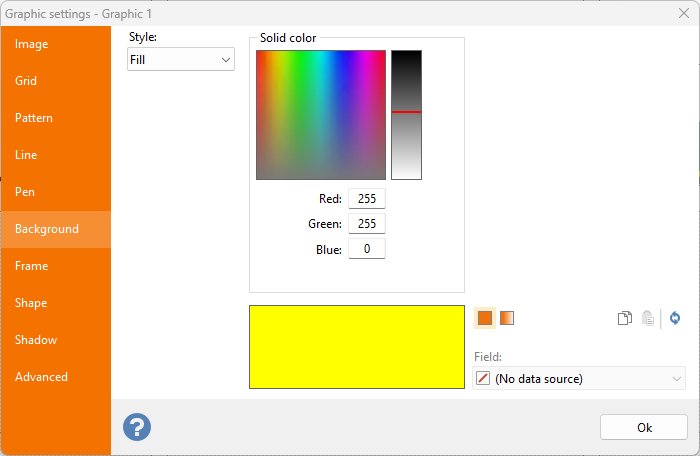 Background: definition of the back color of the graphic element. Background: definition of the back color of the graphic element.
Select Fill from the combo box to enable color definition controls, or Transparent to leave the background transparent.
See the Defining colors topic for more information on creating complex colors and shades. |
|
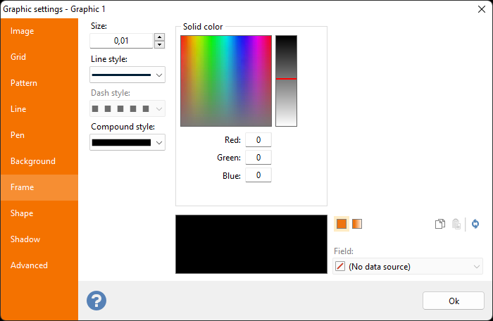 Frame: definition of color, size, style and compund of the frame of the graphic element. Frame: definition of color, size, style and compund of the frame of the graphic element.
Select a value greater than zero to enable color definition controls, or leave at zero to leave the graphic element with no frame.
See the Defining colors topic for more information on creating complex colors and shades. |
|
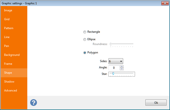 Shape: definition of the element's shape. Shape: definition of the element's shape.
- Ellipse: Select this option to give the element an elliptical or circular shape.
- Rectangle: Select this option to give the element a rectangle or square shape.
Use the Roundness slider to optionally round the corners.
- Polygon: Use this option to give the element a polygonal shape.
Use the Slides combo box to select the number of sides of the polygon and optionally, use the Star slider to convert the polygon into a star-shape.
|
|
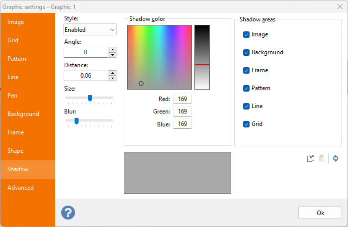 Shadow: definition of the element's optional shadow. Shadow: definition of the element's optional shadow.
- Style: Select Enabled to drop a shadow your graphic object.
- Angle: Definition of the angle with which the shadow will be offset from original elements.
- Distance: Distance of the shadow for the original elements.
- Size: Size of the shadow based on the original element.
- Blur: the shadow out-of-focus effect.
The Shadow areas frame enables you to specifically select a sub-element of the graphic element and enable/disable shadow effects on specific elements. |
|
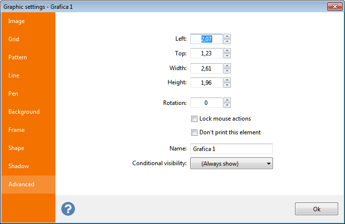 Advanced: common
tab to all elements that enables you to enter coordinates, rotation, mouse action, and a name for the graphic element. Advanced: common
tab to all elements that enables you to enter coordinates, rotation, mouse action, and a name for the graphic element.
|
Note:
Sizes shown here will be in inches or centimeters according to the Unit of measure
setting defined in the General
tab of the Option
dialog box.
Inch fractions can be entered through a popup menu, as explained in the topic manage inch fractions.
Link a data source
If you linked the set to which the graphic element belongs to a data source, it will be possible to link the element to a field of the data source containing images to be rendered which may be different for each label.
You can link 2
data type
families to a graphic element:
- Binary: binary type field (OLE, BLOB, Medium BLOB, etc.). These field types contain the byte
sequence that actually make up the image.
- Text: text type field (CHAR, VARCHAR, etc). Labeljoy will treat the text found here as paths
to image files. It will search for valid image files using the text found here. The images will be rendered only when the path contains a valid reference to an image file.
This can be either absolute paths on your PC's file system or remote paths, for images on the web.
Note:
Labeljoy handles image files of up to 1 MB in size.
