text settings
By double clicking a Text element, its Properties dialog box is displayed on screen. This enables you to customize the element appearance.
The Text dialog box has 9 tabs:
|
Here, you can also set font style and size and apply text effects to parts of the text, using the rich text toolbar. Note: |
|
See the Defining colors topic for more information on creating complex colors and shades. |
|
See the Defining colors topic for more information on creating complex colors and shades. |
|
|
|
See the Defining colors topic for more information on creating complex colors and shades. |
|
See the Defining colors topic for more information on creating complex colors and shades. |
|
|
|
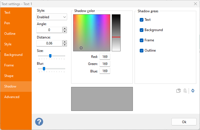
The Shadow areas frame enables you to specifically select a sub-element of the text and enable/disable shadow effects on specific elements. |
|
|
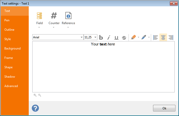 Text: this tab enables you to define the text to be rendered on the labels. It is possible to create compound texts containing fixed text,
 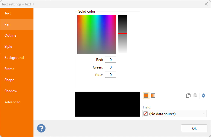 Pen: definition of the color used to fill the text element.
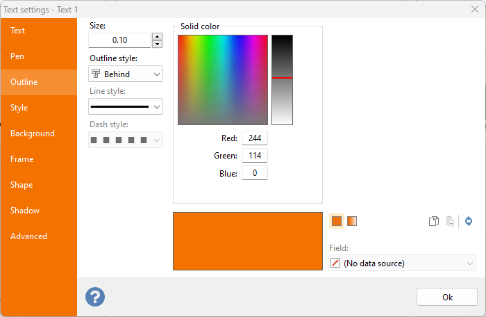 Outline: Set the size to a value greater than zero to enable outline definition controls. In this case the text is drawn with an outline color around the edges. It is also possible to define the size of the outline and the outline style (Behind, Empty and Front).
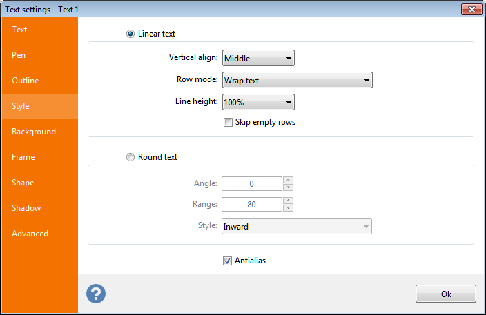
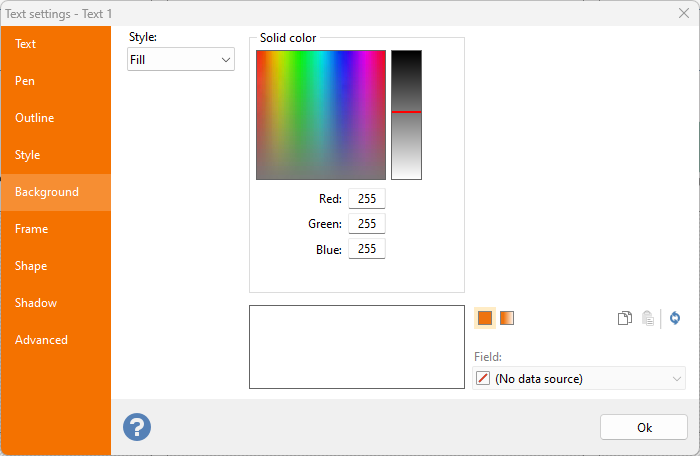 Background: definition of the back color of the text element.
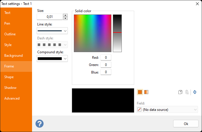 Frame: definition of color, size, style and compound of the frame of the text element.
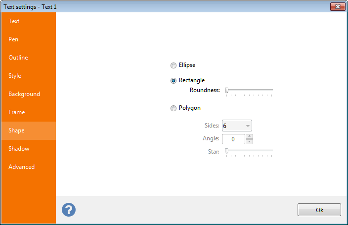
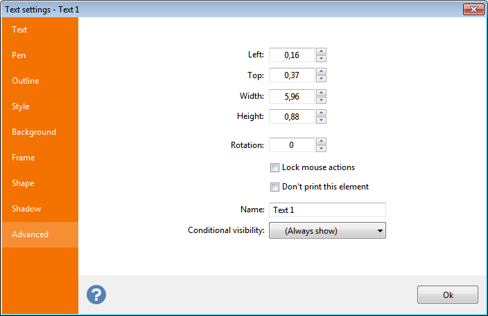 Advanced:
Note:
Sizes shown here will be in inches or centimeters according to the Unit of measure
setting defined in the General
tab of the Option
dialog box.
Inch fractions can be entered through a popup menu, as explained in the topic manage inch fractions.
