Barcode printing best practices
Before you start printing your barcode symbols, there are a few things you need to pay particular attention to. A barcode is good only if it can be read by a barcode scanner. Let’s see what the key factors are when it comes to printing barcodes and how Labeljoy can help you.
1 – Choosing the right size
First of all, you need to carefully consider who will be reading your barcodes: is it for internal use? Is it for the European market or the North American market? Is it for shipping? Your first step is to choose the right symbology, so that when your labels are read, they can be properly interpreted by your customers.
This table should help you decide. It shows barcode symbologies generated by Labeljoy and the corresponding main area of use.
|
EAN 13, EAN 8 |
European market |
|
UPC A, UPC E |
North American market (USA, Canada) |
|
ITF 14 |
Shipping cartons |
|
Code 39, Code 39 Ex. |
US department of defense |
|
Code 93, Code 93 Ex. |
Canadian postal service |
|
Interleaved 2 of 5 |
Distribution, Warehouse, 135 mm Film |
|
Industrial 2 of 5 |
Legacy only: Airline tickets, photofinishing, warehousing |
|
Codabar |
Legacy only: libraries, shipping, and medical industry |
|
Code 11 |
Telecommunication |
|
Code 128 |
General use, globally accepted |
|
GS1 128, EAN 128 |
GS1 international standard for the shipping industry |
|
Postnet, Planet |
US postal service |
|
Data Matrix |
Electronics, US department of defense, Aerospace industry |
|
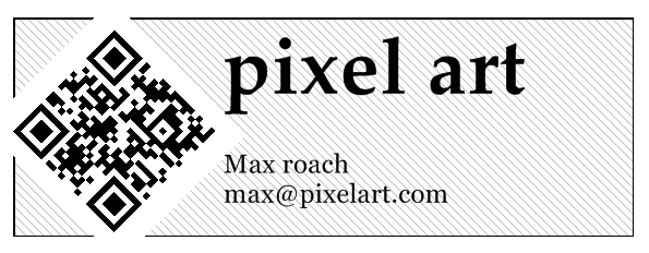
QR Code |
Advertising, industry |
Basically, if you are printing labels for items that are ending up on a supermarket shelf, you need to choose between EAN 13 and UPC A (depending where your market is). If you are printing labels for in-house only use, choose Code 128. If you need to print a large quantity of information, choose Data Matrix. If you are printing an advertising label, choose QR Code so that your symbols can be read by any smartphone
2 – Dimensions
Each symbology was developed with specific rules, not only regulating the encoding (type of transformation of the text into bars), but also defining the size of the bars, the distance between the bars, the size of the visually readable text, the aspect ratio and the total size of the symbol.
Linear barcode symbols such as Code 128 consist of the following elements.
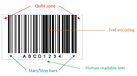
All symbols generated by Labeljoy already contain all the elements needed to ensure proper scanning. Keep in mind that since all label elements are freely moveable and resizable, you might inadvertently create a barcode symbol that is not easily readable or not readable at all. For example, if the symbol becomes too wide or too short, then the original design specifications will become compromised and readability is no longer ensured.
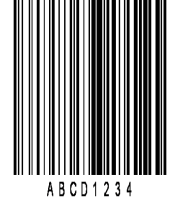
Example of a barcode symbol compromised by bad dimensions:
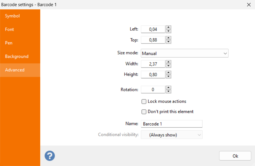
Labeljoy features an automatic sizing functionality for barcode elements that can help you create properly sized barcode symbols. Double click your barcode element and go to the Advanced tab. Check out the setting in the Size mode combo box: When set to Manual, the barcode is freely resizable and you are in charge of defining a size that can ensure proper readability.
Otherwise you can select one of the three Auto size modes.
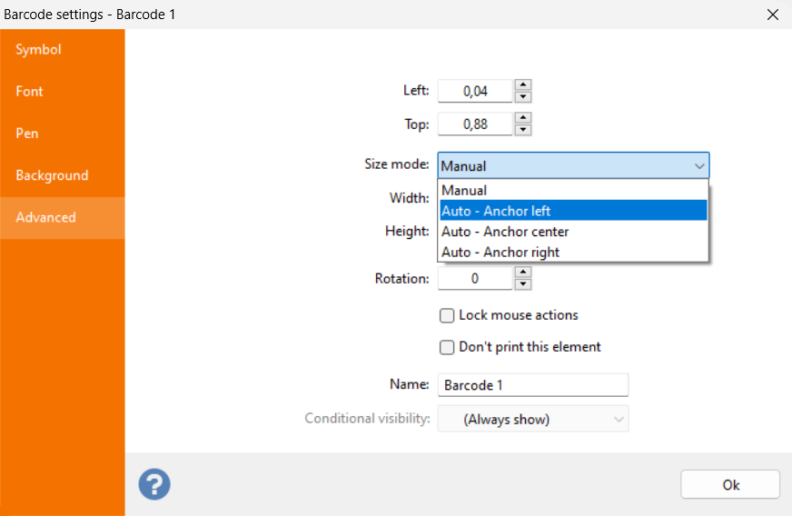
When Size mode is set to one of the three possible Anchor values (Anchor left, Anchor center and Anchor right), the size of the barcode element will be automatically calculated using the barcode specification of the selected symbology. This way you can be sure that the generated symbol will preserve its readability.
In this case, all manual resizing is disabled: the Width and Height text boxes are disabled and you will only be able to use the mouse to reposition the element but not to resize it. This functionality is intended for two purposes:purposes:
- The symbol is encoding static data and you want to make sure its size is properly setup to ensure correct readability.
- The symbol is connected to a data source that contains variable length data, and you want the size of the symbol to shrink or expand according to the encoded data, so that readability is preserved.
In this last scenario the size of the barcode changes at each location, the Anchor point selection will determine which side of the element will be kept Anchored and which will vary:
- Anchor left: The left side of the element is fixed and the right side is changed according to contents.
- Anchor center: both the left and the right side are changed to preserve the horizontal center point of the element.
- Anchor right: The right side of the element is fixed and the left side is changed according to contents.
Generally speaking you should never make a barcode symbol smaller than its default size. Your label design might require you to make it a bit larger, which is fine if you keep the enlargement within about 20% of the original default size. Also pay particular attention to the aspect ratio: when changing the size of a barcode symbol, make sure you vary both width and height proportionally. An important factor to consider is the type of barcode reader that will be used: if you are working in a closed environment, then you can test if the symbols you produce are properly read by your scanners. But if your printing labels for the outside world make sure you keep things as simple as possible.
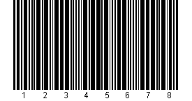
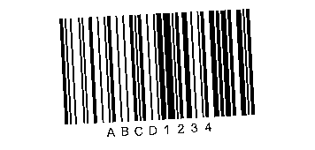
3 – Contrast
By default, all barcode symbols, regardless of the symbology, are created with black bars (or modules for 2D symbologies) on a white background. This choice of colors makes the symbol very easy to scan. When barcodes were first invented, barcode scanners were not as evolved as the ones we have today. Therefore, a high contrast color scheme was a must to ensure proper scanning.
|
Industrial 2 of 5 symbol with black bars on a white background
|
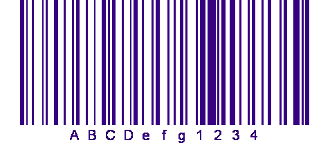
Today the conditions are different: a modern barcode scanner has more processing power than dozens of computers together in the 60s, and the latest CCD scanners can detect elements that are much more complex than simple barcodes.
Quite often barcodes are designed to better fit into their graphical environment. With Labeljoy you can create barcodes with a colorful, even fading background, and / or colored bars:
|
Code 128 symbol with blue bars on white background
|
|
EAN 13 symbol on a pink background
|
|
QR Code symbol with dark green modules on a fading background
|
4 – Rotation
Labeljoy enables you to freely rotate all elements on the page. This applies to barcode symbols as well. For example your label design might require you to have a barcode element rotated by a 45 degree angle:
This is not a problem: barcode scanners and smartphones do not expect symbols to be perfectly aligned to their base angle for scanning. Just keep in mind that the simpler the symbol, the easier it can be read by a large number of devices in a variety of circumstances.
You should also note that computer screens have a much lower resolution than printers. For this reason, the rotated barcode on the screen may look slightly jagged, but it will turn out fine once printed:
|
Rotated symbol on screen (96 dpi)
|
|
Rotated symbol on paper (600 dpi)
|
5 – Printing
Printing is the most important element in creating barcode labels. If there are issues with scanning barcodes, this is mostly due to bad printing.
Linear barcode symbols become unreadable if only one of the bars is damaged or printed incorrectly. This is because linear symbologies do not implement an error correction algorithm: all bars are needed to decrypt the symbol.
On the other hand, 2D symbologies implement error correction algorithms that make it possible for a scanner to correctly read a partially damaged symbol. Nevertheless, if you are printing a 2D barcode, you should not rely on its error correction capabilities to ensure proper scanning: always strive for the best possible result when it comes to printing barcodes.
Here is a short check-list you should always refer to before printing barcodes:
- For inkjet printers, make sure the cartridges are full enough and the print heads are clean.
- For laser printers, make sure the toner level is adequate and the printer rollers are clean.
- For roll printers, make sure that the ink ribbons are working properly.
- If possible, test your barcodes with an outdated scanner: if it works with an older scanner, your symbols can probably be read everywhere.
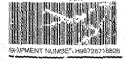
Here is an example of an unreadable barcode due to bad printing and heavy damage:
Here is a short summary of all previous hints for creating barcodes:
- Choose the right symbology: decide based on your customer requirements. If it is for in-house only then you are your own customer, decide based on your infrastructure capabilities (scanner type, type of data to be encoded, etc.).
- Use default dimensions for each symbology.
- Keep it simple, unless you have a specific requirement use black bars on a white background, avoid background transparencies.
- Always honor the quiet zone: do not place text or graphics too close to the symbol or it might end up being unreadable.
- Do not place text or graphics on top of a barcode symbol.
- If you need to include more than one symbol, make sure there is enough space between them, or else scanning a specific symbol will become complicated.
6 – Attaching the labels
One last important aspect is the actual labeling process after the labels have been printed. Even if you have followed all the rules, it can happen that an unreadable label is shipped because it was badly attached to the package.
Here is a list to help you avoid the most common mistakes:
- Choose the right paper: make sure the ink is dry when the label comes out of the printer, so you do not accidentally damage the barcodes during handling.
- Pay attention to the glue: there are dozens of different types of labels; some have permanent glue while others are for attaching/detaching. When choosing the paper, make sure the glue fits your requirements.
- Avoid Distortions: When you attach a barcode label to a small container, a horizontal barcode icon may not be readable. Rotate the barcode 90 or 270 degrees.
- Beware of humidity: if your labels are exposed to humid environments or the weather, you should use special weather-proof labels.
- Pay attention to transparent foils: test the readability of the barcodes if your articles are wrapped in plastic foil.
