page element settings
By double clicking a page element, its dialog box is shown that enables to you to modify its appearance.
The page element dialog box contains 10 tabs:
|
Note: |
|
See the Defining colors topic for more information on creating complex colors and shades. |
|
|
|
|
|
* Clipart images are not available in the Light version. |
|
See the Defining colors topic for more information on creating complex colors and shades. |
|
Note: See the Defining colors topic for more information on creating complex colors and shades. |
|
|
|
The Shadow areas frame enables you to specifically select a sub-element of the text and enable/disable shadow effects on specific elements. |
|
|
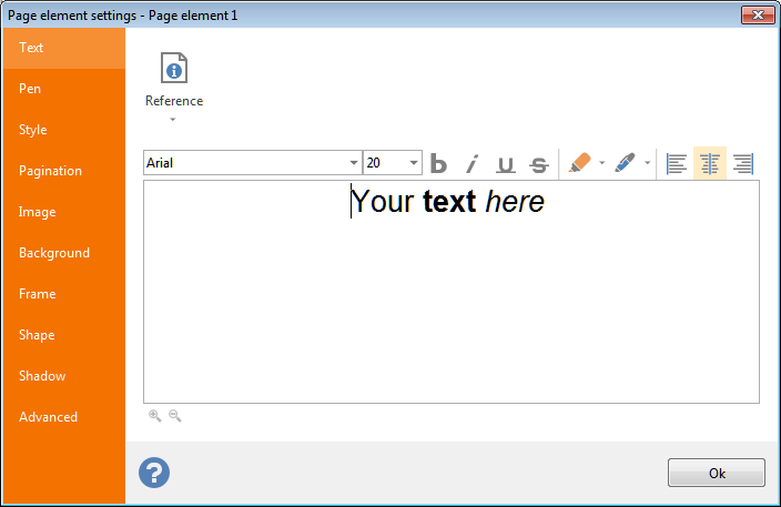 Text: this tab enables you to define the text to be rendered on the labels. It is possible to create compound texts containing fixed text and
 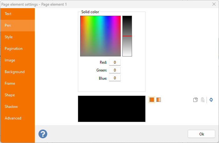 Pen: definition of the color of the page element.
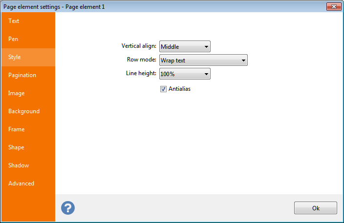 Style: Define horizontal and vertical alignment and horizontal fitting.
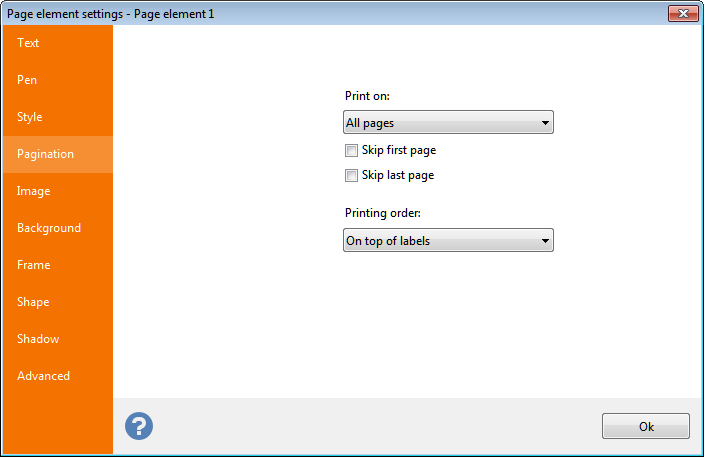 Pagination: The Print on
combo box displayed in this tab enables you to define the page(s) on which the element will be printed.
Pagination: The Print on
combo box displayed in this tab enables you to define the page(s) on which the element will be printed. 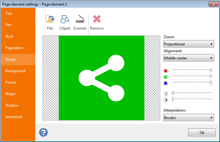 Image: selection of an image to be displayed. You can load a static image from disk, import it from a TWAIN source (such as a scanner) or load it from the
 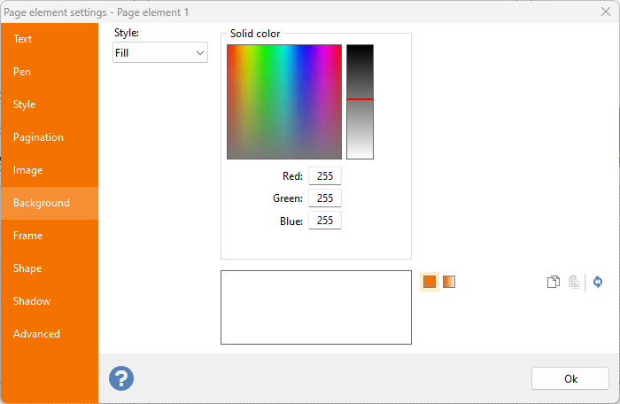 Background: definition of the back color of the page element.
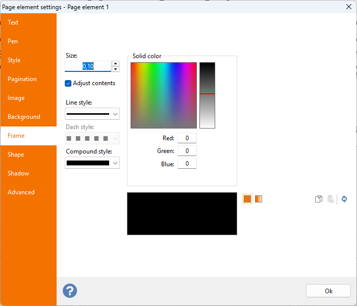 Frame: definition of color, size, style and compound of the frame of the page element.
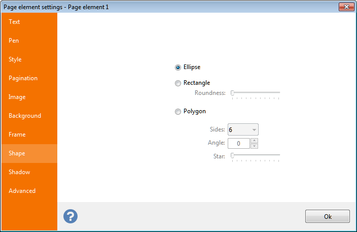 Shape: definition of the element's shape.
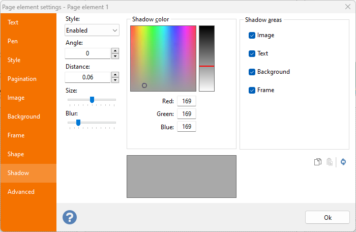
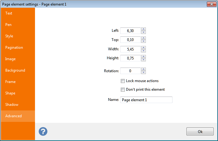 Advanced:
 Note:
Sizes shown here will be in inches or centimeters according to the Unit of measure
setting defined in the General
tab of the Option
dialog box.
Inch fractions can be entered through a popup menu, as explained in the topic manage inch fractions.


